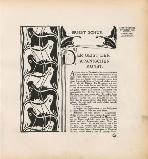
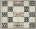
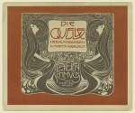
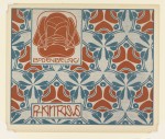
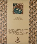
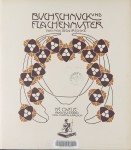
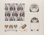
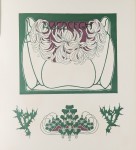
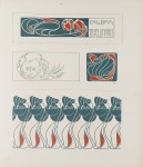
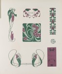
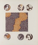
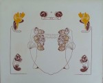
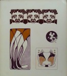
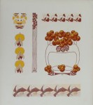
Along with the Secessionist journal Die Flache, Die Quelle remains one of the finest examples of Secession-style graphic design.
The man behind this project was the publisher Martin Gerlach- an engraver and photographer who opened a publishing house in 1874 in Vienna. Referred to by the art critic Joseph August as the “Führer der Moderne” (leader of modernism), Gerlach had aligned himself early on with the new Jugendstil style by collaborating with many of the Secession artists while many were still students. In 1896, he published the portfolio Allegorien-Neue Folge which featured contributions by Gustav Klimt, Carl Otto Czeschka, and Koloman Moser and later the 34-volume children’s books Gerlach’s Jugendbücherei of which Czeschka’s contribution, Die Niebelungen is considered one of the earliest examples of Wiener Werkstätte style. In addition, the Secession group chose Gerlach, then in partnership with Ferdinand Schenk (Gerlach & Schenk) to publish some of their issues of the Secessionist Journal Ver Sacrum, as well as their postcard designs.
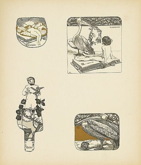
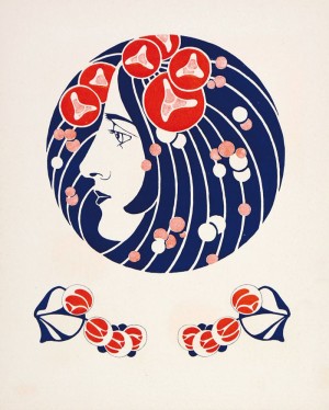
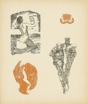
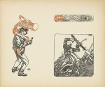
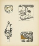
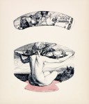
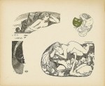
In 1900, Gerlach renewed his collaboration with Czeschka and Moser for Die Quelle, a new 3-volume portfolio devoted entirely to surface decoration. Czeschka was chosen to illustrate the first volume titled Vignetten (vignettes) which showed illustrations for everything from ex-libris to menu designs. In total, the volume had thirty plates with multiple duo-tone illustrations appearing several to a page, in black-and-white and/or one other colour. The second volume titled Buchschmuck (book decorations) featured the work of Max Bernirchke who would later have a leading role in the journal Die Flache. Bernirchke’s curvilinear plant motifs are quintessential Jugendstil and show the strong influence of Belgian and French art nouveau styles.
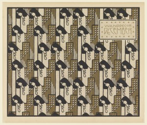
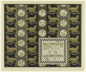
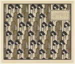
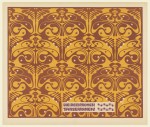
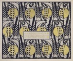
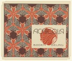
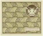
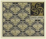
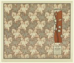
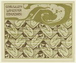
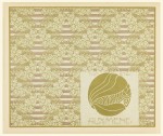
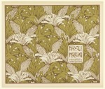
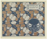
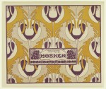
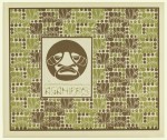
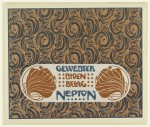
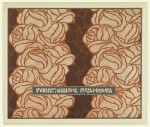
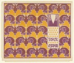
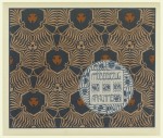
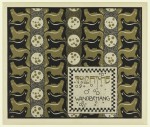
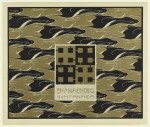
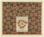
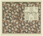
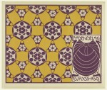
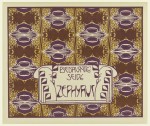
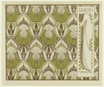
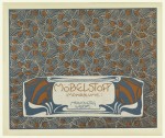
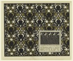
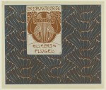
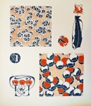
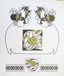
By far the most beautiful of the three volumes is Koloman Moser’s Flächenschmuck (planar ornamentation). This portfolio shows Moser at the height of his talent as a graphic designer with each of the 30 plates demonstrating a beautiful synthesis of type-design and ornamentation. Each colour plate was accompanied by a subtle grey pattern on the reverse side.
Moser had, in fact, completed many of the designs a year earlier for the 4th Secession exhibition in 1899 and they were subsequently published in the Ver Sacrum issue (Heft 4) devoted to him later that year. Nevertheless, Die Quelle gave him an opportunity to expand on the designs by adding decorative text boxes and colour.
- Koloman Moser- Die Quelle
- Koloman Moser- Die Quelle
- Koloman Moser- Die Quelle
- Ver Sacrum, Koloman Moser, 1899
Many of the illustrations reflect Moser’s interest in Japanese textile design which he had already begun exploring as early as 1898 when he collaborated with the textile company Johan Backhausen & Söhne, which would later produce nearly all of the Secession and Wiener Werkstätte designs. As well, we see some the influence of Japanese and Turkish paper marbling techniques which Moser had been teaching to his students at the College of Applied Arts in Vienna. We also see the an early pre-occupation with tesselations and grids in his design for Die Tauusand Raben, Frau Nolda, and Donauwellen Wandekore.
While the influence of art nouveau is very prevalent in Moser’s flower and plant patterns, we also glimpse the beginnings of his move towards geometric abstraction and the emphasis on the square (Wanddecor December and Wandbehag Die Riefezeit). In only a few years, Moser would almost completely abandon the curvilinear style of Art Nouveau seen in Die Quelle and the square would become the central motif of the Wiener Werkstatte.
R.Rosenman, 2015
[hr]
Franz, Rainald. Koloman Moser 1868-1918- Kolo Moser’s Pattern Design with Special Reference to the Design Portfolio “die Quelle” and his work as a designer for the Company Backhausen, London: Prestel for the Leopold Museum Private Foundation.
Reinhofer, Maria. Koloman Moser-Master of Viennese Modernism. Lodnon: Thames & Hudson Ltd. 2002
Franz, Rainald. Koloman Moser- Designing Modern Vienna 1897-1907- Graphic Art. New York: Prestel for the Neue Gallerie. 2013.
- Koloman Moser- Die Quelle
- Koloman Moser- Die Quelle
- Koloman Moser- Die Quelle
- Koloman Moser- Die Quelle
- Koloman Moser- Die Quelle
- Koloman Moser- Die Quelle
- Koloman Moser- Die Quelle
- Koloman Moser- Die Quelle
- Koloman Moser- Die Quelle
- Koloman Moser- Die Quelle
- Koloman Moser- Die Quelle
- Koloman Moser- Die Quelle
- Koloman Moser- Die Quelle
- Koloman Moser- Die Quelle
- Koloman Moser- Die Quelle
- Koloman Moser- Die Quelle
- Koloman Moser- Die Quelle
- Koloman Moser- Die Quelle
- Koloman Moser- Die Quelle
- Koloman Moser- Die Quelle
- Koloman Moser- Die Quelle
- Koloman Moser- Die Quelle
- Koloman Moser- Die Quelle
- Koloman Moser- Die Quelle
- Koloman Moser- Die Quelle
- Koloman Moser- Die Quelle
- Koloman Moser- Die Quelle
- Koloman Moser- Die Quelle
- Koloman Moser- Die Quelle
- Koloman Moser- Die Quelle
- Koloman Moser- Die Quelle
- Koloman Moser- Die Quelle
- Carl Otto Czeschka- Die Quelle
- Carl Otto Czeschka- Die Quelle
- Carl Otto Czeschka- Die Quelle
- Carl Otto Czeschka- Die Quelle
- Carl Otto Czeschka- Die Quelle
- Max Benirschke- Die Quelle
- Max Benirschke- Die Quelle
- Max Benirschke- Die Quelle
- Max Benirschke- Die Quelle
- Max Benirschke- Die Quelle
- Max Benirschke- Die Quelle
- Max Benirschke- Die Quelle
- Max Benirschke- Die Quelle
- Max Benirschke- Die Quelle
- Max Benirschke- Die Quelle
- Max Benirschke- Die Quelle
- Max Benirschke- Die Quelle
- Max Benirschke- Die Quelle

